Widgets
Configurations used to configure widgets. FHIR Core uses widgets to render views.
Examples are rows, columns, cards, and buttons.
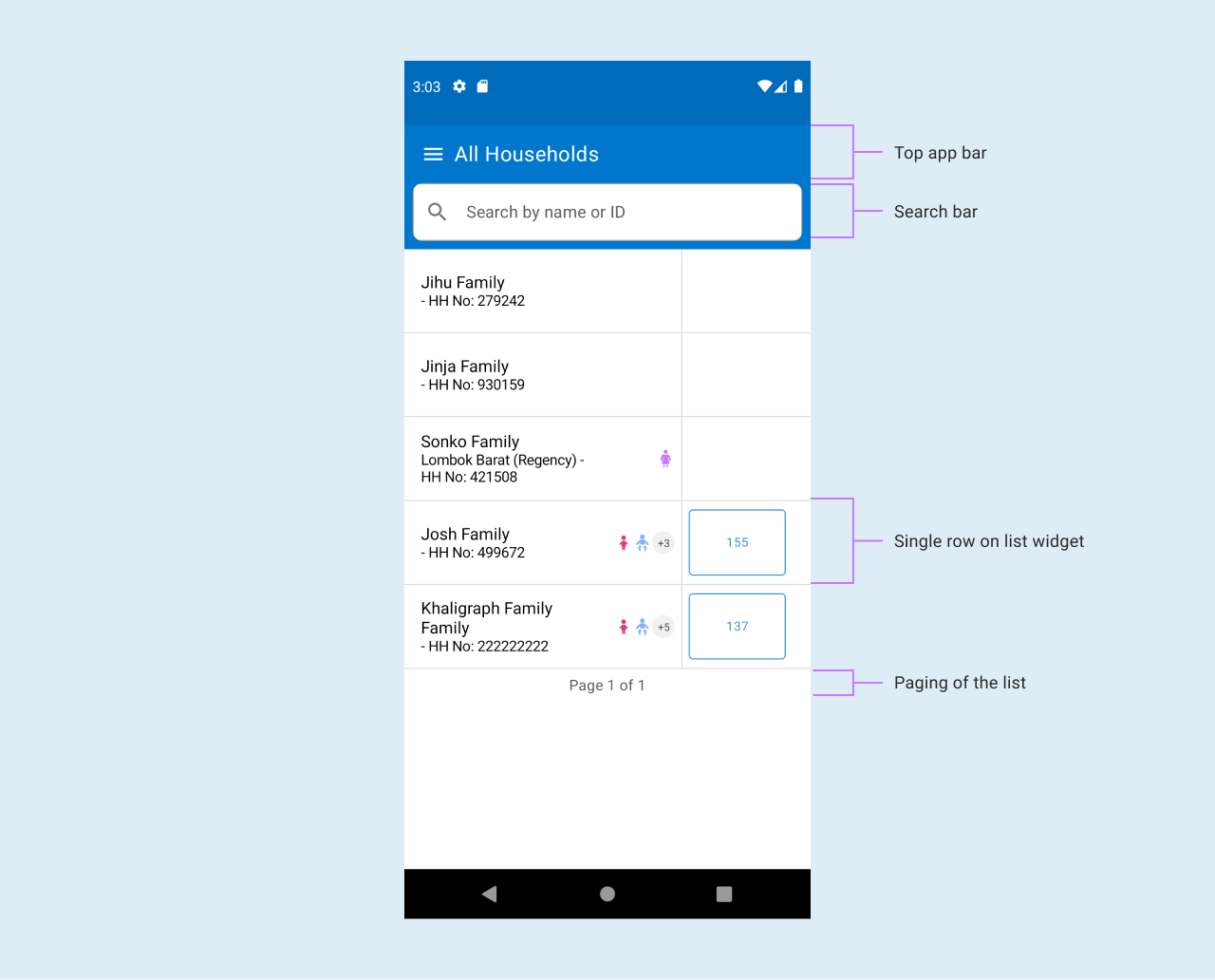
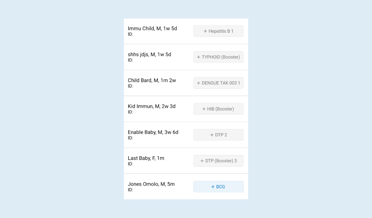
LIST widget
The below image shows how different components are connected to work together through the list widget.
Flex alignment widgets
To display items in the flexRow below sample JSON config works fine. Replace COMPOUND_TEXT with your preferred widget component. Please note, the below json borrows from LIST component properties
{
  "viewType": "LIST",
  "id": "give_your_list_an_id",
  "baseResource": "Resource_to_use",
  "orientation": "HORIZONTAL",
  "emptyList": {
    "message": ""
  },
  "registerCard": {
    "rules": [],
    "views": [
      {
        "viewType": "COMPOUND_TEXT",
        "primaryTextBackgroundColor": "#F9CFD1",
        "primaryText": "@{carePlanTitle}",
        "primaryTextColor": "@{carePlanTextColor}",
        "fontSize": 13,
        "padding": 7,
        "borderRadius": 6
      }
    ]
  }
}
Display resources inside another list
To display list resources inside a list and execute it's rules , add it an attribute called resources inside your list and define it's parameters as shown in the list below If the config doesn't have a resources attribute, the app logic defaults to using relatedResources and executes rules in the rule config section.
{
  "viewType": "LIST",
  "id": "readyTasksList",
  "resources": [
    {
      "id": "availableTask",
      "relatedResourceId": "availableTasks",
      "resourceType": "Task",
      "conditionalFhirPathExpression": "((Task.status = 'ready' or Task.status = 'cancelled' or  Task.status = 'failed') and (Task.code.empty()))"
    }
  ],
  "emptyList": {
    "message": "No visit tasks available for this patient at the moment"
  },
  "registerCard": {
    "rules": [
      {
        "name": "taskStatus",
        "condition": "true",
        "actions": [
          "data.put('taskStatus', fhirPath.extractValue(Task, 'Task.status'))"
        ]
      }
    ],
    "views": [
      {
        "viewType": "BUTTON",
        "smallSized": "true",
        "text": "@{taskDescriptionWithStartDate}",
        "status": "@{taskStatusColorCode}",
        "visible": "true",
        "enabled": "@{patientActive}",
        "actions": [
          {
            "trigger": "ON_CLICK",
            "workflow": "LAUNCH_QUESTIONNAIRE",
            "questionnaire": {
              "id": "@{taskQuestionnaireId}",
              "title": "@{taskDescription}",
              "saveButtonText": "Save",
              "taskId": "@{taskId}",
              "resourceIdentifier": "@{taskFor}"
            }
          }
        ]
      }
    ]
  }
}
Config properties of LIST
| Property | Description | Required | Default |
|---|---|---|---|
| id | Unique identifier for the application | Yes | |
| viewType | First viewType should be a list. This will help in iterating over the data to display | Yes | |
| baseResource | Resource to get data from | Yes | |
| orientation | This is the direction you want to the widgets to flex | yes | VERTICAL |
| emptyList | empty list json with a message to show in case the resource data to display is empty | no but highly recommended | no visits |
| registerCard | card to display widgets at | Yes | |
| views | the desired widgets and their properties to be displayed | ||
| resources | the list resources to execute rules for | No but should be included if you want to display data as described in the sub-title | emptyList() |
| weight | A 'Float' value that represents the type of view. The weight is used to determine how much space the view should occupy in its parent container. | The default is 0 | |
| backgroundColor | The background color of the view, specified as a string in the format "#RRGGBB" or "#AARRGGBB". If this property is null, the view will use its parent's background color. | No | Null |
| padding | Offsets the content of the view by a specific number of pixels. This should be a number | No | 0 |
| borderRadius | Rounds the corners of the view's outer edge | 0 | |
| alignment | The alignment of the view within its parent layout. This value is used to distribute the available space among multiple views | [ViewAlignment.None] | |
| fillMaxWidth | Determines whether the view should fill its parent's width | false | |
| fillMaxHeight | Determines whether the view should fill its parent's height | false | |
| clickable | Determines whether the view is clickable | false | |
| visible | A String value that determines whether the view should be visible | Yes | true |
Config properties of nested LIST
| Property | Description | Required | Default |
|---|---|---|---|
| id | Unique identifier for the resource | no but highly recommended | app defaults to using resourceType.Name |
| relatedResourceId | Unique identifier for the relatedResources | no but highly recommended | app defaults to using resourceType.Name |
| resourceType | The resource to to get/fetch data from e.g Task or Careplan | yes | |
| conditionalFhirPathExpression | FhirPathExpression to get to use when filtering the resource defined in resourceType section | no | app defaults to using relatedResources types and fhirPathexpression |
| sortConfig | Configuration used for sorting LIST widget resource | no | |
| fhirPathExpression | This is the fhir path expression of a given resource | no | |
| relatedResources | resource that is part of the base resource | no |
Goals of the LIST widget
- Display data in a list format
- Support pagination of data
How to use COMPOUND_TEXT
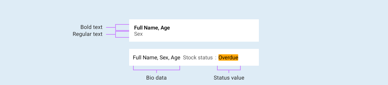
Compound text is a widget that is used to display text of different properties on the user interface.
The below defines the configuration properties for a Compound Text view, which is a view that displays two text strings with an optional separator between them. This view can also have actions associated with each text string.
[
 {
   "viewType": "COMPOUND_TEXT",
   "primaryTextBackgroundColor": "#F9CFD1",
   "primaryText": "@{taskName}",
   "primaryTextColor": "#000000",
   "padding": 7,
   "borderRadius": 6
 },
 {
   "viewType": "COMPOUND_TEXT",
   "primaryText": "Start date: @{taskStartDate}",
   "primaryTextColor": "#5A5A5A",
   "fontSize": 20
 }
]
Config properties of COMPOUND_TEXT
| Property | Description | Required | Default |
|---|---|---|---|
| viewType | First viewType should be a list. This will help in iterating over the data to display | Yes | |
| primaryTextBackgroundColor | The background color of the primary text, specified as a string in the format "#RRGGBB" or "#AARRGGBB". If this property is null, the view will use its parent's background color | No | Null |
| secondaryTextBackgroundColor | The background color of the secondary text, specified as a string in the format "#RRGGBB" or "#AARRGGBB". If this property is null, the view will use its parent's background color | No | Null |
| primaryText | The primary text to be displayed in the view. If the property text is null, no primary text will be displayed | Yes | |
| primaryTextColor | The color of the primary text to be displayed. This should be visible | Yes | |
| fontSize | The font size of the primary and secondary texts, in SP (scaled pixels) | 16 | |
| padding | Offsets the content of the view by a specific number of pixels. This should be a number | No | 0 |
| borderRadius | Rounds the corners of the view's outer edge | 2 | |
| weight | The weight of the view within its parent layout. This value is used to distribute the available space among multiple views. | No | 0 |
| backgroundColor | The background color of the view, specified as a string in the format "#RRGGBB" or "#AARRGGBB". If this property is null, the view will use its parent's background color. | No | Null |
| alignment | The alignment of the view within's its parent layout. This value is used to distribute the available space among multiple views | [ViewAlignment.None] | |
| fillMaxWidth | Determines whether the view should fill its parent's width | false | |
| fillMaxHeight | Determines whether the view should fill its parent's height | false | |
| clickable | Determines whether the view is clickable | false | |
| secondaryText | The primary text to be displayed in the view. If the property text is null, no primary text will be displayed | No | |
| secondaryTextColor | The color of the secondary text, specified as a string in the format "#RRGGBB" or "#AARRGGBB". If this property is null, the view will use its parent's text color | No | Null |
| separator | The separator to display between the primary and secondary texts. If this property is null, no separator will be displayed | No | Null |
| primaryTextFontWeight | The font weight of the primary text | [TextFontWeight.NORMAL] | |
| secondaryTextFontWeight | The font weight of the secondary text | [TextFontWeight.NORMAL] | |
| primaryTextActions | The list of actions associated with the primary text. If the list is empty, no actions will be displayed | ||
| secondaryTextActions | The list of actions associated with the secondary text. If the list is empty, no actions will be displayed | ||
| overflow | Determines how the text should be truncated if it is too long to fit | [TextOverflow.ELLIPSIS] | |
| colorOpacity | Determines how the text color should be in terms of color opacity | Float | |
| textCase | Determines how the text style should be. The text cases are UPPER_CASE, LOWER_CASE, CAMEL_CASE, TITLE_CASE | TextCase | |
| fontSize | Determines how the text size in float. | Float | |
| maxLine | It defines the maximum number of lines you would like the text to be displayed. | Int |
Goals of the COMPOUND_TEXT Widget
- Display text of different properties
How to use BUTTON
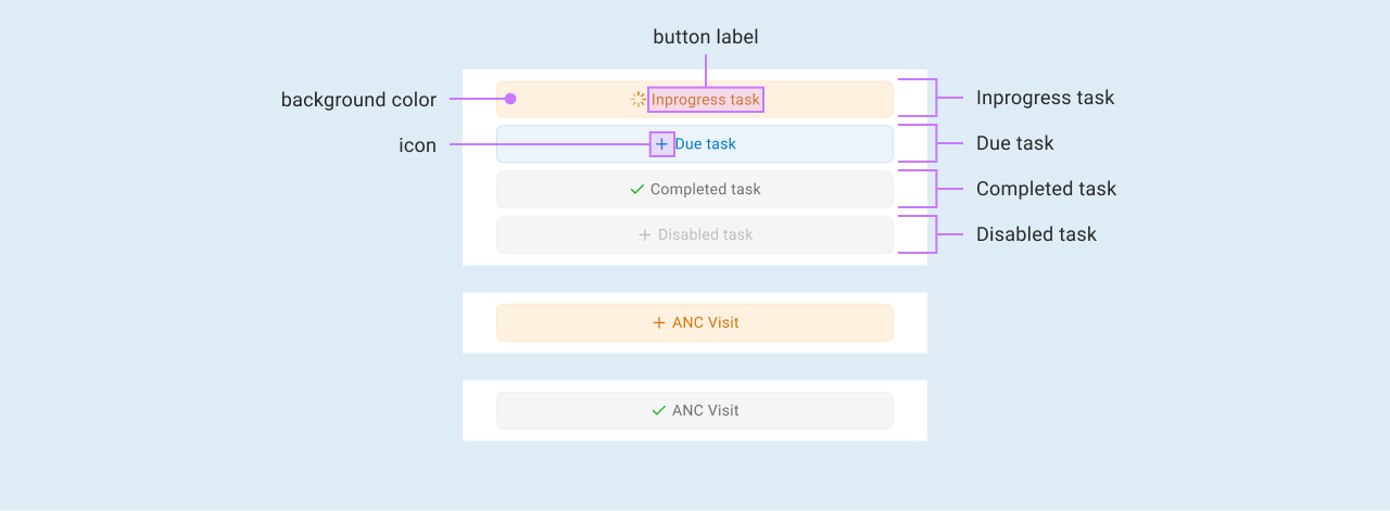
OpenSRP uses buttons to perform actions when clicked.
The below defines the configuration properties of a Button view, which is a view that can perform actions when clicked. Additionally, the button can be styled using available properties such as status, contentColor, and buttonType
[
  {
    "viewType": "BUTTON",
    "smallSized": true,
    "text": "@{taskDescriptionWithStartDate}",
    "status": "@{taskStatusColorCode}",
    "visible": "true",
    "enabled": "true",
    "actions": []
  }
]
Config properties of BUTTON
| Property | Description | Required | Default | Values |
|---|---|---|---|---|
| viewType | The view type should be BUTTON it helps in knowing the kind of view at hand | Yes | ||
| text | The text represents the button name that is what the button action name is e.g Add Patient | Yes | ||
| status | Styles the button appearance according to the declared service status | Yes | DUE, OVERDUE, UPCOMING,COMPLETED, IN_PROGRESS, EXPIRED | |
| visible | The state whether a button should be shown or hidden | No | ||
| enabled | Determines if the button is active, indicating whether it's configured to perform the required user action | Yes | "true" | |
| clickable | Determines whether a button can be clicked to perform its declared action | No | false | true, false |
| actions | This is a list of operation that the button does when it is clicked | Yes | ||
| backgroundColor | The background color of the view, specified as a string in the format "#RRGGBB" or "#AARRGGBB". If this property is null, the view will use its parent's background color. | No | Null | |
| padding | Offsets the content of the view by a specific number of pixels. This should be a number | No | 0 | |
| alignment | The alignment of the view within's its parent layout. This value is used to distribute the available space among multiple views | [ViewAlignment.None] | START, END, CENTER, NONE | |
| fillMaxWidth | Determines whether the view should fill its parent's width | true | ||
| fillMaxHeight | Determines whether the view should fill its parent's height | false | ||
| fontSize | The font size of the primary and secondary button, in float | 14.0f | ||
| borderRadius | Rounds the corners of the view's outer edge | 14 | ||
| startIcon | Specify an icon to be shown before the text | null | ||
| letterSpacing | The amount of space to be added between each letter of the button's text | 0 | ||
| buttonType | Specify the button size | ButtonType.MEDIUM | TINY, MEDIUM, BIG | |
| contentColor | The content color of the view, specified as a string in the format "#RRGGBB" or "#AARRGGBB". If this property is null, the view will use its parent's content color. | No | Null |
How to use button with icon and copy ability
On top of the above properties, you need to add Image config properties see a startIcon config *** IMAGE widget *** . This displays the icon before the button text
      {
                 "viewType": "BUTTON",
                 "smallSized": "true",
                 "text": "Button text",
                 "status": "DUE",
                 "visible": "visibility condition",
                 "enabled": "enable condition",
                 "startIcon": {
                   "type": "local",
                   "reference": "icon_name if local",
                   "color": "icon color"
                 },
                 "actions": [
                   {
                     "trigger": "ON_CLICK",
                     "workflow": "COPY_TEXT",
                     "params": [
                       {
                         "paramType": "PARAMDATA",
                         "key": "your copy key e.g myKey",
                         "value": "The value to be copied"
                       }
                     ]
                   }
                 ]
               }
The data in the params section is transformed into resourceData and the value read in key-value and copied to the clipboard/keyboard
Goals of the BUTTON widget
- The main aim of a button is to provide a way to perform action when it is clicked.
- Buttons provides the capability to launch a new action like logging into the app.
- Buttons are used to complete an ongoing action like saving input user credentials to the database
SERVICE_CARD widgets
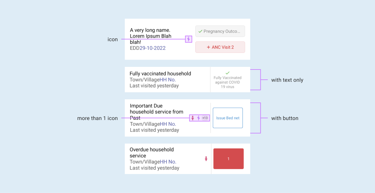
The Service Card widget displays Patient's details and other related services and tasks. In the example below, the details field within the SERVICE_CARD displays the patient's name and ID.
{
  "viewType": "COLUMN",
  "children": [
    {
      "viewType": "SERVICE_CARD",
      "details": [
        {
          "viewType": "COMPOUND_TEXT",
          "primaryText": "@{patientName}",
          "primaryTextColor": "#000000"
        },
        {
          "viewType": "COMPOUND_TEXT",
          "primaryText": "ID: @{patientId}",
          "fontSize": 14,
          "primaryTextColor": "#000000"
        }
      ],
      "showVerticalDivider": true,
      "serviceButton": {
        "visible": "@{showMemberTasks}",
        "text": "@{taskDescription}",
        "status": "@{serviceStatus}",
        "smallSized": true,
        "enabled": "false",
        "actions": []
      },
      "actions": [
        {
          "trigger": "ON_CLICK",
          "workflow": "LAUNCH_PROFILE",
          "id": "otherRegistersProfile"
        }
      ]
    }
  ]
}
Config properties of SERVICE_CARD
| Property | Description | Required | Default |
|---|---|---|---|
| viewType | First viewType should be a list. This will help in iterating over the data to display | Yes | [ViewType.SERVICE_CARD] |
| weight | A 'Float' value that represents the type of view. The weight is used to determine how much space the view should occupy in its parent container. | The default is 0 | |
| backgroundColor | The background color of the view, specified as a string in the format "#RRGGBB" or "#AARRGGBB". If this property is null, the view will use its parent's background color. | No | the default value is #FFFFFF |
| padding | Offsets the content of the view by a specific number of pixels. This should be a number | No | 0 |
| borderRadius | Rounds the corners of the view's outer edge | 2 | |
| alignment | The alignment of the view within's its parent layout. This value is used to distribute the available space among multiple views | [ViewAlignment.None] | |
| fillMaxWidth | Determines whether the view should fill its parent's width | false | |
| fillMaxHeight | Determines whether the view should fill its parent's height | false | |
| clickable | Determines whether the view is clickable | true | |
| visible | A String value that determines whether the view should be visible | Yes | true |
| details | A list of CompoundTextProperties that represent the details of the service card | yes | emptyList() |
| showVerticalDivider | A Boolean value that determines whether a vertical divider should be displayed in the service card view | Yes | false |
| service-memberIcons | A String value that represents the icons for the service members associated with the service card | yes | null |
| serviceButton | A ButtonProperties object that represents a button displayed in the service card | Yes | null |
| services | A list of ButtonProperties that represent the services associated with the service card | yes | null |
| actions | A list of ActionConfig objects that represent the actions that can be performed on the service card | yes | emptyList() |
serviceMemberIcons
One of the config properties of the SERVICE_CARD viewType are the serviceMemberIcons. Some icons provided within fhircore
for use include the  ,
,  ,
,  ,
,
 ,
,  , and
, and  .
.
Since you could have many icons intended for use, it could be better to extract the icons and add a reference to them within the service card. Below is an example of a list of extraction rules for BABY_BOY and BABY_GIRL.
{
  "name": "serviceMemberIcons",
  "condition": "true",
  "actions": [
    "data.put('serviceMemberIcons', StringUtils:join([fhirPath.extractValue(Patient, \"Patient.active and (Patient.birthDate >= today() - 5 'years') and (Patient.gender= 'male')\") == 'true'? 'BABY_BOY': '', fhirPath.extractValue(Patient, \"Patient.active and (Patient.birthDate >= today() - 5 'years') and (Patient.gender= 'female')\") == 'true'? 'BABY_GIRL': ''], ','))"
  ]
}
After storing the extracted icons into the data map, we can then reference them while configuring the SERVICE_CARD as exemplified below.
{
  "viewType": "SERVICE_CARD",
  "details": [
    ...
  ],
  "serviceMemberIcons": "@{serviceMemberIcons}"
}
Goals of the SERVICE_CARD widget
- To display patient details and tasks.
- Give the ability to display icon based on the reference provided.
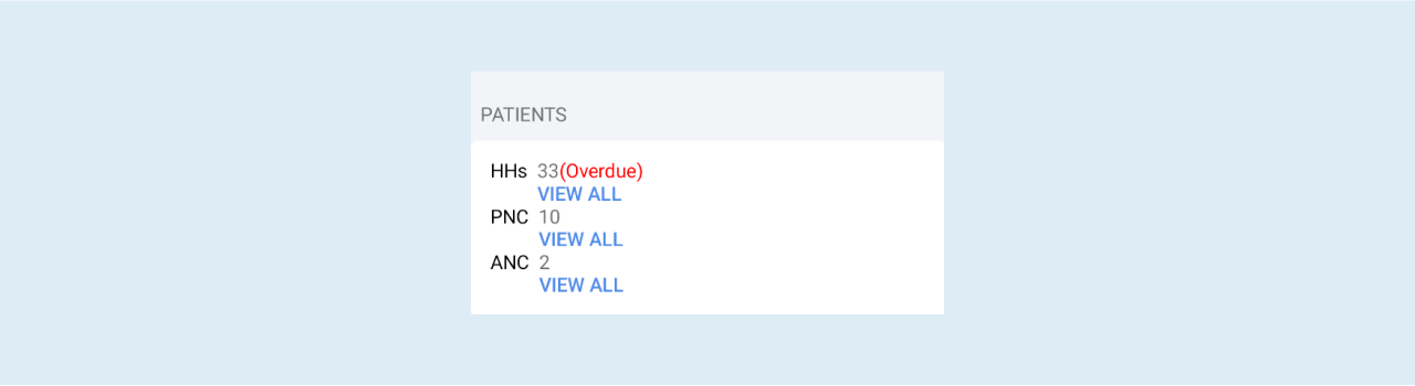
COLUMN widgets
The column widgets are used to create a vertical layout container that can hold multiple child views. The purpose of the "COLUMN" is to arrange child views in a vertical column, with the child views stacked on top of one another in the order in which they are added.
{
  "viewType": "COLUMN",
  "weight": 0.7,
  "children": [
    {
      "viewType": "COMPOUND_TEXT",
      "primaryText": "VIEW ALL",
      "primaryTextColor": "#006EB8",
      "clickable": true,
      "fontSize": 14,
      "primaryTextActions": [
        {
          "trigger": "ON_CLICK",
          "workflow": "LAUNCH_REGISTER",
          "id": "pncRegister",
          "display": "@{practitionerName} - PNC Register"
        }
      ]
    }
  ]
}
Config properties of COLUMN
| Property | Description | Required | Default |
|---|---|---|---|
| viewType | First viewType should be a list. This will help in iterating over the data to display | Yes | [ViewType.COLUMN] |
| weight | A 'Float' value that represents the type of view. The weight is used to determine how much space the view should occupy in its parent container. | The default is 0 | |
| backgroundColor | The background color of the view, specified as a string in the format "#RRGGBB" or "#AARRGGBB". If this property is null, the view will use its parent's background color. | No | Null |
| padding | Offsets the content of the view by a specific number of pixels. This should be a number | No | 0 |
| borderRadius | Rounds the corners of the view's outer edge | 0 | |
| alignment | The alignment of the view within its parent layout. This value is used to distribute the available space among multiple views | [ViewAlignment.None] | |
| fillMaxWidth | Determines whether the view should fill its parent's width | false | |
| fillMaxHeight | Determines whether the view should fill its parent's height | false | |
| clickable | Determines whether the view is clickable | false | |
| visible | A String value that determines whether the view should be visible | Yes | true |
| spacedBy | An integer value that represents the spacing between the children views of the column | 8 | |
| wrapContent | A boolean value that represents whether the column should wrap its content or not | false | |
| arrangement | An enum value that represents the vertical arrangement of the child views of the column | Null | |
| children | A list of ViewProperties objects that represents the child views of the column | emptyList() | |
| showDivider | show divider is a boolean variable the gives the capability to show divider within the column if its needed | String | |
| action | A list of ActionConfig that represents the child actions that can be performed within the column | emptyList() |
Goals of the COLUMN widget
- To arrange data or views vertically.
IMAGE widget

Displays icons or images.The below json shows how image widget can be configured.
{
  "viewType": "IMAGE",
  "tint": "#FFFFFF",
  "size": 40,
  "imageConfig": {
    "type": "local",
    "reference": "@{taskStatusIcon}"
  },
  "padding": 4,
  "backgroundColor": "@{taskStatusIcon}",
  "isCircular": true
}
Config properties of IMAGE
| Property | Description | Required | Default |
|---|---|---|---|
| viewType | Yes | [ViewType.IMAGE] | |
| tint | a string specified as RGB Hex e.g '#FFFFFF' | ||
| backgroundColor | The background color of the Image, specified as a string in the format "#RRGGBB" or "#AARRGGBB". If this property is null, the view will use its parent's background color. | No | Null |
| padding | Offsets the content of the view by a specific number of pixels. This should be a number | No | 0 |
| size | Size of the image in pixels | 24 | |
| imageConfig | The property that points to the actual image. It can either point to a local drawable or a server side Binary file | [ViewAlignment.None] | |
| padding | Determines whether the view should fill its parent's width | false | |
| shape | Used to clip the image into a shape e.g into a circle or rectangle | false | |
| borderRadius | Rounds the corners of the view's outer edge | 0 | |
| alignment | The alignment of the view within its parent layout. This value is used to distribute the available space among multiple views | [ViewAlignment.None] | |
| fillMaxWidth | Determines whether the view should fill its parent's width | false | |
| fillMaxHeight | Determines whether the view should fill its parent's height | false | |
| clickable | Determines whether the view is clickable | false | |
| visible | A String value that determines whether the view should be visible | Yes | true |
| weight | A 'Float' value that represents the type of view. The weight is used to determine how much space the view should occupy in its parent container. | The default is 0 |
Goals of the IMAGE widget
- The main aim is just to show the icon and image.
ROW widgets

The purpose of the row is to act as a container for organizing and laying out its child views horizontally.
{
  "viewType": "ROW",
  "arrangement": "SPACE_BETWEEN",
  "fillMaxWidth": true,
  "children": [
    {
      "viewType": "COLUMN",
      "children": [
        {
          "viewType": "COMPOUND_TEXT",
          "primaryText": "Last restock",
          "primaryTextColor": "#5A5A5A",
          "fontSize": 18.0
        },
        {
          "viewType": "COMPOUND_TEXT",
          "primaryText": "Previous restock ",
          "fontSize": 16.0,
          "secondaryText": "@{lastRestockedDate}"
        }
      ]
    },
    {
      "viewType": "COMPOUND_TEXT",
      "primaryText": "@{lastRestockedAmount}",
      "primaryTextColor": "#000000",
      "fontSize": 16.0
    }
  ]
}
Config properties of ROW
| Property | Description | Required | Default |
|---|---|---|---|
| viewType | Specifies the type of view | Yes | [ViewType] |
| weight | The weight of the row. It determines how much space this row should occupy relative to other rows in a layout that uses weights. | No | The default is 0 |
| backgroundColor | The background color of the row.It is specified as a string in the format "#RRGGBB" or "#AARRGGBB". If this property is null, the view will use its parent's background color. | No | Null |
| padding | Offsets the content of the view by a specific number of pixels. This should be a number | No | 0 |
| borderRadius | The radius of the row's corners in pixels. Setting this value creates rounded corners for the row. | 0 | |
| alignment | Specifies the alignment of the row's content within the row. | [ViewAlignment.NONE] | |
| fillMaxWidth | If set to true, the row will attempt to occupy the maximum available width in its parent layout. | false | |
| fillMaxHeight | If set to true, the row will attempt to occupy the maximum available height in its parent layout. | false | |
| clickable | Indicates whether the row is clickable. If set to "true", the row can be interacted with and handle click events. | false | |
| visible | Specifies the visibility of the row. If set to "true", the row will be visible, otherwise, if set to "false", it will be hidden | true | |
| spacedBy | The spacing between the children views of the row, in pixels. | 8 | |
| arrangement | Specifies the arrangement of the children views within the row. | ||
| wrapContent | If set to true, the row's width and height will adjust to wrap its content tightly. | false | |
| children | A list of ViewProperties objects representing the children views within the row. | emptyList() |
VIEW Widget
Defines the hierarchical structure of views to be rendered. It contains various properties that define its appearance and behavior.
"views": [
  {
    "viewType": "COLUMN",
    "children": [
      {
        "viewType": "SERVICE_CARD",
        "details": [
          {
            "viewType": "COMPOUND_TEXT",
            "primaryText": "@{patientName}",
            "primaryTextColor": "#000000"
          },
          {
            "viewType": "COMPOUND_TEXT",
            "primaryText": "{{ id.patient.id }}",
            "fontSize": 14,
            "primaryTextColor": "#000000"
          }
        ],
        "showVerticalDivider": false,
        "serviceButton": {
          "visible": true,
          "text": "{{ anc.visit }}",
          "status": "DUE",
          "smallSized": true
        },
        "actions": [
          {
            "trigger": "ON_CLICK",
            "workflow": "LAUNCH_PROFILE",
            "id": "defaultProfile",
            "params": [
              {
                "key": "patientId",
                "value": "@{patientId}"
              }
            ]
          }
        ]
      }
    ]
  }
]
Config properties of VIEW
| Property | Description | Required | Default |
|---|---|---|---|
| viewType | Specifies the type of view. It acts as a discriminator to identify the type of view during runtime. | Yes | [ViewType] |
| weight | It defines the weight of the view, which is typically used in layout containers with weighted distribution to control the amount of space a view occupies relative to other views. | Float | |
| backgroundColor | t represents the background color of the view, specified as a color code in the format "#RRGGBB" or "#AARRGGBB". If null, it indicates a transparent background. | String? | |
| padding | It defines the padding around the content of the view, in pixels. | No | Int |
| borderRadius | It specifies the radius of the view's corners in pixels. Setting this property creates rounded corners for the view. | Int | |
| alignment | Specifies the alignment of the row's content within the row. | [ViewAlignment] | |
| fillMaxWidth | It indicates whether the view should attempt to occupy the maximum available width in its parent layout. | Boolean | |
| fillMaxHeight | It indicates whether the view should attempt to occupy the maximum available height in its parent layout. | Boolean | |
| clickable | Indicates whether the view is clickable. If set to "true", the row can be interacted with and handle click events. | String | |
| visible | Specifies the visibility of the view. If set to "true", the row will be visible, otherwise, if set to "false", it will be hidden | String |
Divider Widget

The Divider widget allows one to visually separate and organize different components within a graphical user interface (GUI). It creates a horizontal line that acts as a visual boundary, enhancing the overall aesthetics and user experience.
To use the Divider widget in the app, one has to define the JSON file as follows:
{
  "viewType": "BORDER",
  "thickness": 0.8
}
The JSON configuration instructs the app to create a Divider widget with the following properties:
- View Type: The
viewType: BORDERsetting specifies the type of widget that will be rendered, and in this case, it is set to"BORDER"type which renders a solid horizontal line as the divider. - Thickness: The
thickness: 0.8setting determines the width of the Divider. By adjusting the thickness value, one can precisely control the Divider's visual appearance.
Config properties of DIVIDER
| Property | Description | Required | Default |
|---|---|---|---|
| viewType | The type of widget that will be rendered in this case it is the BORDER view. | Yes | [ViewType.BORDER] |
| thickness | The width of the Divider. | No | 0.5 |
| backgroundColor | The background color of the view, specified as a string in the format "#RRGGBB" or "#AARRGGBB". If this property is null, the view will use its parent's background color. | No | #FFFFFF |
| visible | A string value that determines whether the view should be visible | No | true |
| padding | Offsets the content of the view by a specific number of pixels. This should be a number | No | 0 |
Spacer Widget
The Spacer widget is used to create a flexible, empty space between two views. It is used to create a space between two views in a layout, and it is also used to create a space between the edge of a view and its parent layout.
To use the Divider widget in the app, one has to define the JSON file as follows:
{
  "viewType": "SPACER",
  "height": 10
}
After defining the above JSON example a view will be rendered with the following properties:
- View Type: The
viewType: SPACERsetting specifies that the widget that will be rendered is a spacer, which creates an empty space or gap between other UI elements. - Height: The
height: 10setting determines the height of the spacer. By setting the height value to 10, the spacer will have a height of 10 density-independent pixels which scales appropriately across different screen densities, ensuring consistent visual appearance on various devices.
Config properties of SPACER
| Property | Description | Required | Default |
|---|---|---|---|
| viewType | The type of widget that will be rendered in this case it is the SPACER view. | Yes | [ViewType.SPACER] |
| height | The height of the Spacer. | Yes | _ |
| backgroundColor | The background color of the view, specified as a string in the format "#RRGGBB" or "#AARRGGBB". If this property is null, the view will use its parent's background color. | No | #FFFFFF |
| padding | Offsets the content of the view by a specific number of pixels. This should be a number | No | 0 |
Stack view widget
The Stack View Widget can hold a list of child views, allowing you to arrange them one on top of the other. The Stack View acts as a container that vertically stacks its child views. It provides a way to create layered layouts where elements can be positioned on top of each other. This makes it ideal for use cases like:
- Overlaying informational elements like badges or icons on top of content.
- Creating progress indicators or loaders that sit on top of the main view.
- Implementing toasts or pop-up notifications that appear above the primary content.
Example JSON:
{
  "viewType": "STACK",
  "backgroundColor": "successColor",
  "size": 100,
  "opacity": 0.1,
  "children": [
    {
      "viewType": "IMAGE",
      "alignment": "CENTER",
      "size": 90,
      "imageConfig": {
        "type": "local",
        "reference": "ic_main_image"
      },
      "isCircular": false
    },
    {
      "viewType": "IMAGE",
      "size": 38,
      "visible": "true",
      "imageConfig": {
        "type": "local",
        "reference": "ic_alert_triangle"
      },
      "isCircular": true
    }
  ]
}
Config properties of STACK VIEW WIDGET
The Stack View Widget inherits common properties from the ViewProperties class. These properties allow you to configure the general appearance and behavior of the stack, including:
- weight
- backgroundColor
- padding
- borderRadius
- alignment
- fillMaxWidth
- fillMaxHeight
- clickable
- visible
Stack view specific properties include :
| Property | Description | Required | Default |
|---|---|---|---|
| viewType | Specifies the type of view. In this case, it's always STACK to identify it during runtime | Yes | [STACK] |
| backgroundColor | this represents the background color of the container view, specified as a color code in the format "#RRGGBB" or "#AARRGGBB". If null, it indicates a transparent background. | String? | |
| opacity | Opacity of the view, ranging from 0.0 (fully transparent) to 1.0 (fully opaque). | No | Float |
| size | Height of the stack view in pixels. If not set, the stack will wrap its content | No | Int |
| children | List of child view definitions. Each child view definition should be a valid JSON object representing a supported view type (e.g., COMPUNDTEXT, IMAGE, BUTTON).. | List |
Personal Data Widgets
Personal data widget, defines personal data like age to it's corresponding value in a more organised way.It takes a list of mapped items as input.It contains various properties that defines its behavior.
{
   "viewType":"PERSONAL_DATA",
   "weight":1.0,
   "personalDataItems":[
      {
         "label":{
            "viewType":"COMPOUND_TEXT",
            "primaryText":"@{runningBalance}",
            "primaryTextColor":"#000000",
            "primaryTextFontWeight":"SEMI_BOLD"
         },
         "displayValue":{
            "viewType":"COMPOUND_TEXT",
            "primaryText":"Available",
            "fontSize":14,
            "primaryTextColor":"#000000"
         }
      }
   ]
}
Config properties of PERSONAL DATA WIDGET
| Property | Description | Required | Default |
|---|---|---|---|
| viewType | Specifies the type of view. It acts as a discriminator to identify the type of view during runtime. | Yes | [PERSONAL_DATA] |
| weight | It defines the weight of the view, which is typically used in layout containers with weighted distribution to control the amount of space a view occupies relative to other views. | Float | |
| backgroundColor | t represents the background color of the view, specified as a color code in the format "#RRGGBB" or "#AARRGGBB". If null, it indicates a transparent background. | String? | |
| padding | It defines the padding around the content of the view, in pixels. | No | Int |
| borderRadius | It specifies the radius of the view's corners in pixels. Setting this property creates rounded corners for the view. | Int | |
| alignment | Specifies the alignment of the row's content within the row. | [ViewAlignment] | |
| fillMaxWidth | It indicates whether the view should attempt to occupy the maximum available width in its parent layout. | Boolean | |
| fillMaxHeight | It indicates whether the view should attempt to occupy the maximum available height in its parent layout. | Boolean | |
| clickable | Indicates whether the view is clickable. If set to "true", the row can be interacted with and handle click events. | String | |
| visible | Specifies the visibility of the view. If set to "true", the row will be visible, otherwise, if set to "false", it will be hidden | String | |
| personalDataItems | It indicate the list of two text that is label and its corresponding display value | List |
Card Widget
Card are used to represent single coherent piece of content
{
   "viewType":"CARD",
   "header":{
      "viewType":"COMPOUND_TEXT",
      "primaryText":"HOUSEHOLD MEMBERS",
      "primaryTextColor":"#6F7274",
      "fontSize":18.0,
      "padding":16
   },
   "contentPadding":0,
   "content":[

   ]
}
Config properties of CARD WIDGET
| Property | Description | Required | Default |
|---|---|---|---|
| viewType | Specifies the type of view. It acts as a discriminator to identify the type of view during runtime. | Yes | [PERSONAL_DATA] |
| weight | It defines the weight of the view, which is typically used in layout containers with weighted distribution to control the amount of space a view occupies relative to other views. | Float | |
| backgroundColor | t represents the background color of the view, specified as a color code in the format "#RRGGBB" or "#AARRGGBB". If null, it indicates a transparent background. | String? | |
| padding | It defines the padding around the content of the view, in pixels. | No | Int |
| borderRadius | It specifies the radius of the view's corners in pixels. Setting this property creates rounded corners for the view. | Int | |
| alignment | Specifies the alignment of the row's content within the row. | [ViewAlignment] | |
| fillMaxWidth | It indicates whether the view should attempt to occupy the maximum available width in its parent layout. | Boolean | |
| fillMaxHeight | It indicates whether the view should attempt to occupy the maximum available height in its parent layout. | Boolean | |
| clickable | Indicates whether the view is clickable. If set to "true", the row can be interacted with and handle click events. | String | |
| visible | Specifies the visibility of the view. If set to "true", the row will be visible, otherwise, if set to "false", it will be hidden | String | |
| content | It indicate a section where you can specify the views to be included within the card it takes list of view properties | emptyList() | |
| cornerSize | It indicate the size of card corner bend a card should have it is in integer form | Int | |
| elevation | It indicate the size of raise a card should have it is in integer form | Int | |
| header | It indicate the heading text of the card it can only be used when it is required | CompoundTextProperties | |
| headerBackgroundColor | It specifies the header background color of the card it takes the color code as a string | String | |
| headerAction | It specifies what the header action what it supposed to perform when it is clicked | CompoundTextProperties | |
| emptyContentMessage | It specifies what message should be displayed within the card when it has no content | String | |
| contentPadding | It specifies the card content spacing | Int |
Goals of the CARD widget
- CARD widgets are used to group similar data together in a single view. For example, when you want user contact details to be in a centralized place you can group that information, like username, age, phone number, and country of residence, under a single card.